Choosing the Right Font for Your Banner Message
As you stand before a blank canvas, ready to paint your message onto a banner, you know that every stroke matters.
And just as the colors you choose convey emotions, the font you select can speak volumes about your message.
But with countless options at your disposal, how do you choose the right font that will captivate your audience and convey your intended tone?
The answer lies in understanding the power of typography and its impact on the success of your banner.
Importance of Font Selection
Why is font selection important for your banner message?
The font you choose for your banner message plays a crucial role in effectively conveying your message to your target audience. The right font can grab attention, create a visual impact, and enhance the overall design of your banner. On the other hand, a poor font choice can make your message difficult to read and diminish its impact.
The first reason font selection is important is readability.
You want your banner message to be easily understood by anyone who sees it. Choosing a font that’s clear, legible, and easy on the eyes ensures that your message can be read quickly and effortlessly. Additionally, the font should be appropriate for the size of your banner. A font that’s too small or too large can hinder readability and make your message less effective.
The second reason is branding.
The font you choose can help reinforce your brand identity and create a consistent look across all your marketing materials. By using a font that aligns with your brand’s personality and values, you can strengthen brand recognition and make your banner message more memorable.
Factors to Consider
When choosing a font for your banner message, there are several factors that you should take into consideration. These factors will help you make an informed decision and ensure that your banner is effective in delivering its message.
Firstly, you need to consider the readability of the font. It’s important to choose a font that’s easy to read from a distance. Avoid fonts that are too fancy or decorative, as they can be difficult to decipher. Opt for fonts with clean lines and clear characters.
Secondly, consider the tone and message of your banner. Different fonts convey different emotions and aesthetics. For example, a bold and blocky font may be suitable for a banner promoting a sale, while a more elegant and cursive font may be fitting for a wedding announcement. Choose a font that aligns with the tone and purpose of your message.
Additionally, think about the context in which your banner will be displayed. Will it be indoors or outdoors? Will it be viewed on a screen or in print? These factors can impact the legibility and visibility of your chosen font. Make sure to select a font that’s suitable for the specific environment in which your banner will be seen.
Lastly, keep in mind the branding and consistency of your overall visual identity. If you already have a specific font associated with your brand, it would be wise to use that font in your banner as well. Consistency in font usage helps reinforce your brand identity and create a cohesive visual experience for your audience.
Readability and Legibility
To ensure that your banner message is easily read and understood, prioritize the readability and legibility of the font you choose. When it comes to design, it’s easy to get carried away with fancy and decorative fonts. However, it’s important to remember that the main purpose of a banner message is to convey information clearly and effectively.
Readability refers to how easily the letters and words can be recognized and distinguished from each other. A font with good readability will have clear and well-defined letterforms, making it easy to read even from a distance. On the other hand, a font with poor readability may cause confusion and make it difficult for your audience to understand your message.
Legibility, on the other hand, is about how easily the text can be read at a smaller size or from a distance. A font with good legibility will maintain its clarity and readability even when scaled down or viewed from afar. It’s important to choose a font that doesn’t lose its integrity when used in different sizes or situations.
When selecting a font for your banner message, consider choosing one that strikes a balance between style and readability. Opt for fonts that have clear, distinct letterforms and are easy to read from a distance. Remember, the purpose of your banner message is to communicate information effectively, so prioritize readability and legibility to ensure your message is easily understood by your audience.
Conveying the Right Tone
Choose a font that conveys the appropriate tone for your banner message to effectively communicate your message to your audience. The font you choose can greatly impact how your message is perceived and understood. To convey the right tone, consider the following:
1. Serif fonts: These fonts, with their small decorative strokes at the ends of characters, convey a sense of tradition, elegance, and authority. They’re often used for formal or prestigious messages.

2. Sans-serif fonts: These fonts, without the decorative strokes, are clean, modern, and convey a sense of simplicity and clarity. They’re often used for contemporary or minimalist messages.
3. Script fonts: These fonts mimic handwriting and convey a sense of elegance, creativity, and personal touch. They’re often used for invitations or artistic messages.
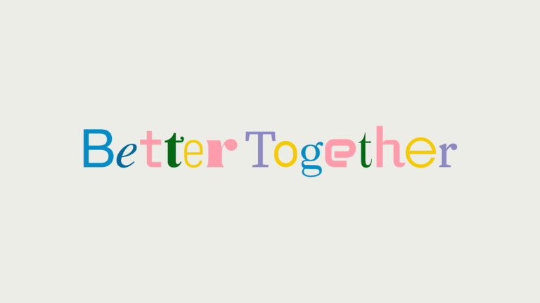
4. Display fonts: These fonts are unique and eye-catching, often used for attention-grabbing headlines or bold statements. They can convey a sense of fun, excitement, or urgency.
Capturing Audience Attention
To captivate your audience’s attention, select a font that immediately grabs their eye and ignites their curiosity. The font you choose for your banner message can make all the difference in capturing the attention of your audience. Think about it – when you’re scrolling through a website or walking past a billboard, what makes you stop and take notice? It’s often the font that stands out from the rest, the one that catches your eye and draws you in.
So, how do you choose the right font to captivate your audience? First, consider the style of your message. If you’re promoting a fun and playful event, a bold and whimsical font might be the way to go. On the other hand, if you’re advertising a professional conference, a sleek and modern font would be more appropriate.
Additionally, pay attention to the readability of the font. Make sure it’s easy to read from a distance or at a quick glance.
Frequently Asked Questions
How Can I Create a Visually Appealing Banner Message Without Using Fancy Fonts?
Creating a visually appealing banner message without using fancy fonts is totally doable! Start by focusing on the basics like font size, spacing, and alignment.
Opt for clean and simple fonts that are easy to read from a distance. Experiment with bold or italic variations to add emphasis.
Use contrasting colors that stand out against the background.
Lastly, make sure your message is concise and impactful.
With these tips, your banner message will be sure to catch people’s attention!
Are There Any Specific Fonts That Work Best for Banners Targeting a Younger Audience?
Are you looking for fonts that will capture the attention of a younger audience?
Well, when it comes to banners targeting a younger crowd, there are a few specific fonts that tend to work best. Fonts like Comic Sans, Impact, and Century Gothic are popular choices. They have a playful and modern feel that resonates well with younger individuals.
What Font Size Is Recommended for a Banner Message Displayed at a Distance?
When displaying a banner message at a distance, it’s recommended to use a font size that’s easily readable. Consider using a larger font size to ensure maximum visibility.
This will allow people to read the message from a distance without straining their eyes. Remember, the purpose of a banner is to communicate a message effectively, so choosing the right font size is crucial in capturing the attention of your target audience.
Can I Use Multiple Fonts in a Single Banner Message to Convey Different Emotions or Ideas?
Yes, you can definitely use multiple fonts in a single banner message to convey different emotions or ideas. By using different fonts, you can create visual diversity and enhance the overall impact of your message.
Just make sure to choose fonts that complement each other and maintain readability. Experiment with different combinations and sizes to find the right balance and achieve the desired effect.
Are There Any Accessibility Considerations to Keep in Mind When Choosing a Font for a Banner Message?
When choosing a font for your banner message, it’s important to consider accessibility. Different fonts can affect readability for individuals with visual impairments or reading disabilities. Opt for fonts that are easy to read, with clear and distinct letterforms. Avoid decorative or script fonts that may be difficult to decipher.
Additionally, make sure the font size is large enough to be legible from a distance. By prioritizing accessibility, you can ensure that your banner message is effectively communicated to all viewers.
Conclusion
When it comes to choosing the right font for your banner message, it’s crucial to consider factors such as readability, conveying the right tone, and capturing audience attention.
The font you select can greatly impact how your message is perceived and understood. By carefully considering these factors and selectin look at this web-site g a font that aligns with your branding and message, you can effectively communicate your message and leave a lasting impression on your audience.


