Color Accessibility in Banner Design for All Audiences
Have you ever wondered if the colors used in banner design can truly be appreciated by all audiences?
The theory that color accessibility plays a crucial role in effective communication is one that cannot be ignored. In a world where inclusivity is increasingly valued, it is essential to ensure that the colors we choose in banner design are accessible to everyone.
But how do we achieve this? What are the guidelines and techniques that can help us create banners that are visually appealing and accessible to all?
Join us as we explore the fascinating world of color accessibility in banner design and uncover the key to reaching a diverse range of audiences.
Understanding Color Vision Deficiencies
Understanding color vision deficiencies can be crucial for creating inclusive and accessible designs. When designing banners or any visual content, it’s important to consider the needs of individuals with color vision deficiencies. Approximately 8% of men and 0.5% of women worldwide experience some form of color vision deficiency. By understanding these deficiencies, you can ensure that your designs are accessible to a wider audience.

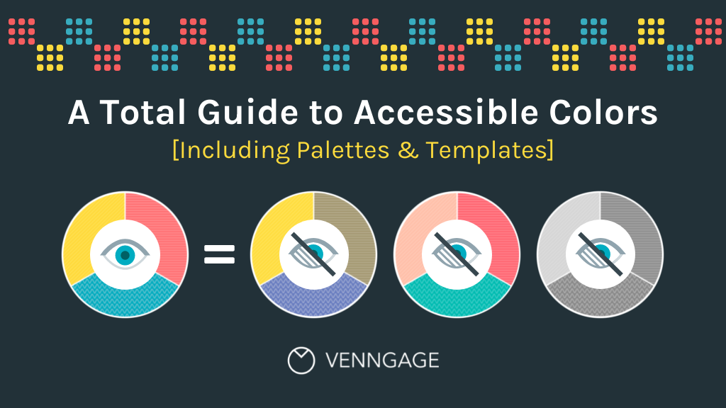
Color vision deficiencies occur when individuals have difficulty distinguishing between certain colors. The most common type is red-green color blindness, where individuals have trouble differentiating between shades of red and green. Another type is blue-yellow color blindness, which affects the ability to perceive blue and yellow colors accurately. Understanding the different types of color vision deficiencies allows you to make informed decisions when choosing color palettes for your designs.
To create inclusive designs, consider using color combinations that are easily distinguishable by individuals with color vision deficiencies. Avoid relying solely on color to convey important information, and instead, use other visual cues like text, symbols, or patterns. Additionally, you can provide alternative text or captions to describe colors, ensuring that the content is accessible to everyone.
The Impact of Inaccessible Colors in Banner Design
Using inaccessible colors in banner design can have a negative impact on the user experience and exclude individuals with color vision deficiencies. Here is how it affects them:
1. Limited perception: People with color vision deficiencies may struggle to perceive certain colors or distinguish between similar shades. If a banner relies heavily on these inaccessible colors, important information or calls to action may be lost on these individuals, leading to confusion or missed opportunities.
2. Reduced readability: Inaccessible color combinations can make text difficult to read. Imagine a banner with low contrast between the background and the text, making it hard for users to decipher the message. This can be frustrating and off-putting, causing users to abandon the banner altogether.
3. Alienation and exclusion: When individuals with color vision deficiencies encounter banners that they can’t fully engage with, they may feel excluded or marginalized. This can create a negative perception of the brand or organization behind the banner, potentially leading to a loss of trust and loyalty.
Guidelines for Choosing Accessible Color Palettes
When selecting colors for your banner design, it’s important to consider guidelines for creating accessible color palettes. These guidelines ensure that your design can be easily perceived and understood by all audiences, including those with visual impairments or color vision deficiencies.
One important guideline is to use sufficient color contrast. This means choosing colors that have a noticeable difference in brightness or hue. For example, avoid pairing light colors with light colors or dark colors with dark colors, as this can make it difficult for some users to distinguish between them. Instead, opt for a combination of light and dark colors to create a clear contrast.
Another guideline is to use color combinations that are universally recognizable and don’t rely solely on color perception. This is important because not all users may be able to perceive colors accurately. By using additional visual cues, such as icons or labels, you can ensure that the message of your banner is conveyed effectively regardless of color perception.
Techniques for Enhancing Color Contrast in Banners
To enhance color contrast in your banners, consider incorporating bold and vibrant hues that create a striking visual impact. By using these techniques, you can ensure that your message is easily readable and accessible to all audiences.
Here are three techniques to enhance color contrast in your banners:
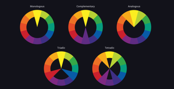
1. Use complementary colors: Pairing colors that are opposite each other on the color wheel, such as blue and orange or purple and yellow, creates a high contrast effect. This helps the text or important elements in your banner stand out.
2. Adjust brightness and saturation: Increase the brightness and saturation of your colors to make them more vibrant. This will make your banner more visually appealing and draw attention to the important elements.
3. Add a dark background: Using a dark background, such as black or a deep navy blue, can create a stark contrast with the text and other elements in your banner. This makes the text more legible and ensures that it stands out against the background.
Testing and Optimizing Banner Accessibility for All Audiences
To ensure that your banners are accessible to all audiences, it’s important to test and optimize their accessibility.
Testing your banners for accessibility involves evaluating how well they can be perceived and understood by individuals with different visual abilities. One way to test the accessibility of your banners is by using automated accessibility testing tools. These tools can help identify any potential issues with color contrast, text readability, and other accessibility factors.
Additionally, manual testing is crucial to ensure that your banners meet the needs of all users. This can involve reviewing the banners with individuals who’ve different visual impairments or using assistive technologies, such as screen readers, to evaluate their accessibility.
After testing, it’s essential to optimize your banners based on the feedback and results obtained. This may involve adjusting the color contrast, font size, or layout to enhance readability and ensure that the banners are accessible to all users.
Frequently Asked Questions
How Do Color Vision Deficiencies Affect People’s Ability to Perceive Colors in Banner Design?
Color vision deficiencies can significantly impact your ability to perceive colors in banner design. These deficiencies can make it difficult for you to distinguish between certain colors, leading to a distorted visual experience. For example, individuals with red-green color blindness may struggle to differentiate between shades of red and green, making it challenging to understand the intended message or visual hierarchy in a banner.
Designers must consider these limitations and ensure that their designs are accessible to all audiences, regardless of color vision deficiencies.
What Are the Potential Consequences of Using Inaccessible Colors in Banner Design?
Using inaccessible colors in banner design can have significant consequences. It can make your message difficult to read and understand for individuals with color vision deficiencies. This can result in a loss of engagement and potential customers.
In addition, it may lead to a negative perception of your brand’s inclusivity and accessibility. By considering color accessibility in your design, you can ensure that your banners are effective and inclusive for all audiences.
How Can Designers Choose Accessible Color Palettes for Their Banners?
To choose accessible color palettes for your banners, consider the following tips.
First, aim for a high level of contrast between the background color and the text. This ensures readability for all audiences.
Second, use color tools such as color contrast checkers to determine if your chosen colors meet accessibility standards.
Lastly, consider using color combinations that are universally recognized as easy to read, such as black text on a white background.
What Techniques Can Be Used to Enhance Color Contrast in Banner Design?
To enhance color contrast in your banner designs, there are a few techniques you can use.
First, make sure to choose colors that have a significant difference in brightness or hue. This will help make your text or images stand out.
Additionally, you can add a border or outline around your elements to create a clear separation.
Lastly, consider using a high contrast background to make your banner visually striking and accessible to all audiences.
What Are the Best Practices for Testing and Optimizing Banner Accessibility for All Audiences?
To ensure banner accessibility for all audiences, there are some best practices you should follow.
Start by testing the color contrast to ensure it meets accessibility guidelines. Use tools that simulate different types of color blindness to assess how your banner looks.
Make sure the text is large enough and easy to read. Also, consider providing alternative text for images and using clear and concise language.
Regularly test and optimize your banners to ensure they’re accessible to everyone.
Conclusion
In conclusion, ensuring color accessibility in banner design is crucial to reach and engage all audiences.
Understanding color vision deficiencies and the impact of inaccessible colors is the first step.
By following guidelines for choosing accessible color palettes and employing techniques to enhance color contrast, banners can be optimized for maximu other m accessibility.
Regular testing and optimization will help ensure that all audiences can fully experience and benefit from banner content.


